A Brownstone Home Expansion Designed Around Family Life
When a young family on Manhattan’s Upper West Side added about eight feet to the back of their brownstone, the new depth made room for a third bedroom upstairs and a main floor that could hold everything the household needed. Mudan Interior Design reworked the interior layouts, finishes and built-ins across the family’s three levels so this home expansion would support how they actually live: reading, cooking, commuting by bike and growing up together.
Planning an Upper West Side Brownstone Around Daily Life
The homeowners, a professional couple with two young children, planned to stay for the long term.
By the time they contacted Mudan, an interior proposal had already been developed, but it didn’t feel like them. Their taste leaned toward understated contemporary interiors within a traditional architectural shell, and they wanted a home organized around their routines: a daily bike commute, a large and growing book collection, a room for each child, and space for visiting family. We revisited most of the interior decisions, starting with the plan.
Project Snapshot
Location
Upper West Side, New York City
SIZE
3100 square feet
COST
$$$$
Scope
Brownstone renovation with a rear addition of approximately eight feet on the first and second floors. Mudan Interior Design assisted with space planning, interior layouts, kitchen and bathroom design, finish selections, millwork design, and construction-phase coordination.
A brownstone’s first floor is long and narrow, and this one had to hold a great deal: a vestibule, bike storage, a study with substantial book storage, a living room, a dining room, a kitchen and a powder room. Even with the added depth, every foot had to work.
For us, interior design and space planning begin with furniture drawn at its actual size. The earlier proposed layout appeared to work on paper, but with sofas, tables and desks at accurate scale, the home office claimed nearly a third of the floor, leaving the living room, dining room and kitchen to share the rest. The rooms the family would use together every day would have felt compressed, and the problem might not have surfaced until furniture arrived after construction.
Instead of three oversized zones, we treated the floor as one long volume and organized it into four proportioned spaces, in sequence from the front: study, living room, dining area and kitchen. Placing the kitchen at the rear, within the addition’s new depth, created a logical progression from the front door and improved circulation from room to room. That is the real test of space planning in interior design: not whether rooms fit on paper, but whether people can live in them.
The Earlier Proposal and the Revised Plan
Compare the earlier proposed layout with our revised plan for the family’s daily routines.
Existing Floor Plan
Existing footprint, before the rear addition
Architect's Floor Plan
Earlier proposed layout, before the interior redesign
Revised Floor Plan
Revised layout for the family’s daily routines
Connecting the Study, Living Room, Dining Room and Kitchen
The vestibule is small, roughly five by seven and a half feet, but it gives coats, wet boots and city weather a place to stop before the hardwood beyond. A dedicated closet nearby gives the bicycle a permanent home, out of sight, after every commute.
As the hardest-working floor in the house, the vestibule became one of the project’s deliberate splurges. Instead of a standard entry tile, we designed a patterned tile floor that reads like an area rug, with a decorative center field framed by a border.
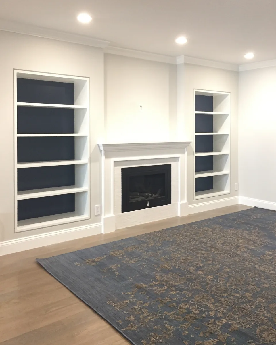
Past the study, the living room centers on a fireplace framed by deep blue bookcases, one of several places where the family’s library became part of the architecture.
At the rear, the kitchen is organized by activity, with zones for preparation, cooking, pantry storage and a beverage station for morning coffee. Two pull-out pantry cabinets and an island scaled to the room keep it efficient. White Shaker cabinetry, quartz counters chosen for durability and easy upkeep, and a white subway-tile backsplash keep the palette quiet. With kitchen, dining and living spaces connected, dinner can be under way while homework spreads across the dining table.
A Jewel-Box Powder Room
Back on the main floor, the powder room is the house’s one moment of drama: lower-wall paneling, crown molding, polished nickel fixtures, a transitional mirror and decorative lighting, with a wall-mounted toilet and sink that make the small room feel more open. When the homeowners hesitated over a darker palette, we prepared two renderings, one light and one dark. Seeing them side by side, they chose the darker room.
A Family Level with Room to Grow
Upstairs, the addition’s extra depth allowed the second floor to change from two bedrooms to three, so each child could have a room of their own. Those rooms were kept simple and adaptable rather than themed.
The added space also made room for a primary suite with its own bathroom. A custom headboard wall combines upholstered panels, built-in nightstands, bookshelves and a reading light placed for late-night reading. Laundry sits in the hallway outside the suite, close to the bedrooms it serves.
The bathrooms show how composition can elevate familiar materials. In the primary bathroom, a marble steam shower, heated towel warmer and polished nickel fixtures draw on boutique-hotel ideas, while a marble border with a thin black liner gives the floor a rug-like frame. In the children’s bathroom, classic white subway tile is set vertically and framed with a similar border, and a wall-mounted toilet and floating vanity leave more floor visible in a compact room.
Before
AFTER
Flexible Space for Play and Guests
The lower level once felt like a typical New York cellar: dark, utilitarian and cut off from the rest of the house. It is now a flexible family floor with an open play area, a seating area with a sofa bed for visiting grandparents, a full bathroom with a shower, generous storage and more built-in bookshelves.
Explore the Custom Millwork
Books appear on nearly every level of this house, in built-ins designed as part of the architecture rather than added afterward.
CONTINUE THE TOUR · CHAPTER 2
Custom Millwork
A study that combines desk, library and window bench; deep blue bookcases around the fireplace; and a headboard with built-in nightstands and reading storage.
Plans can look balanced until furniture is placed to scale.
Size rooms by use.
Rooms that host several daily activities deserve more space.
Plan the route first.
A clear path through the home makes every room easier to use.
Design storage for specific things.
Bikes, books and shoes each need different space.
Decide before you build.
Layout problems are easier to solve on paper than after walls go up.
Collaboration Through Construction
Over roughly three years of design and construction, the project depended on close collaboration among the homeowners, the general contractor and our studio. Drawings and renderings let the family evaluate decisions before construction, and regular site meetings let us coordinate details, answer field questions and review the work against the design intent.
The project’s success shows less in any single room than in how naturally the family settled in. The books have shelves, the bike has a closet, each child has a room, and the back of the house brings everyone together at the end of the day.
Planning a Home Expansion or Renovation?
If you’re adding space or reworking a layout, the most valuable decisions often happen before construction drawings are final. We’d be glad to hear how your family lives.